Insights in Neat
Please Note: You must be on an active Neat + Automated Insights subscription to take advantage of the features in this article.
Neat now provides business owners with a dedicated dashboard that highlights Business Health (KPIs). You can view at-a-glance graphs detailing how your business is performing on a monthly and yearly basis.
Insights FAQs
- What are Insights?
- How do I access these Insights?
- What is Net Cash Flow?
- What are Top Expense Categories?
- What is Cash Balance?
- What is Profit & Loss?
- What are Total Sales?
What are Insights?
Insights will provide you with basic intelligence and accounting KPIs to better understand the health of your business. By interpreting expense and income data, Neat will surface prescriptive advice for you, removing the uncertainty and anxiety that can come from not knowing basic business metrics such as cash in and cash out. Neat is taking the guesswork out of running your business. The Business Health Insights Dashboard gives you real-time data about key accounting metrics like net profit, sales, cash flow, and more.How do I access these Insights?
Select Insights from the left-hand navigation. Once you have accessed the Insights dashboard, you will be able to view charts for Net Cash Flow, Top Expense Categories, Cash Balance, Total Sales, and Profit & Loss.
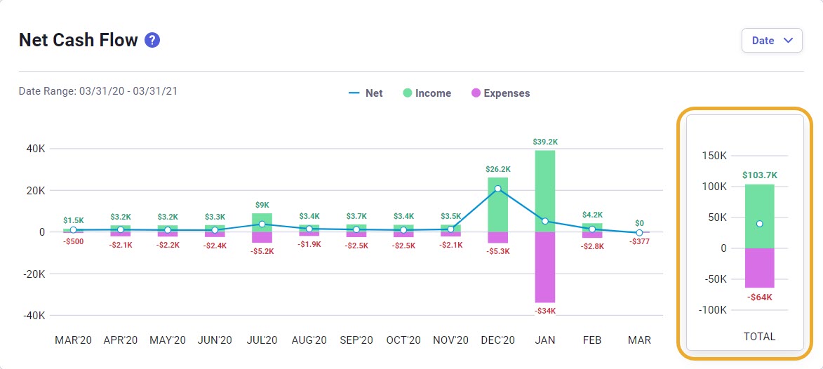
What is Net Cash Flow?
Cash flow refers to the money that moves in and out of your business. You can use this chart to understand how well you are balancing this flow of money. Inflows are the total of all income (sales) accounts, and outflows are the total of all categories you assign expenses to. When you subtract expenses from your sales, the result is net cash flow. The higher this number is, or a trend line that is moving up and to the right, the better your company is performing.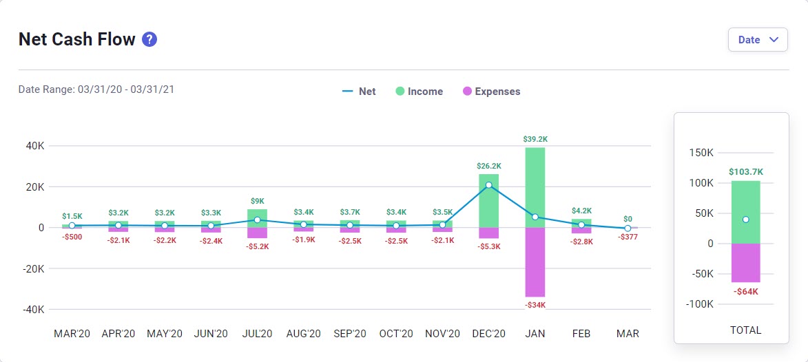
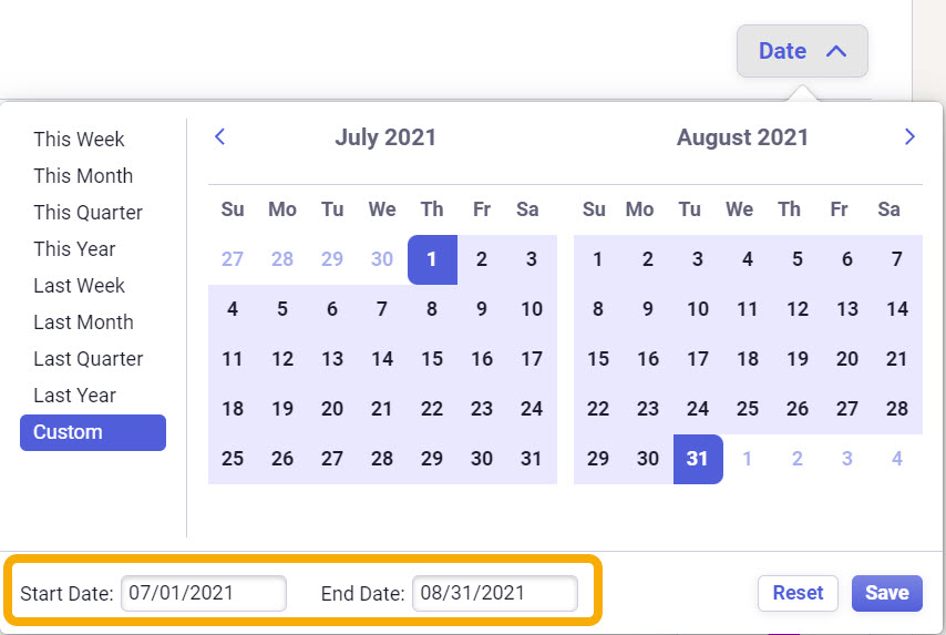
Click the blue 'Date' drop-down in the upper right of the Net Cash Flow chart to adjust the date range. Alternatively, you can type in your date range in the Start and End date fields at the bottom of the modal.
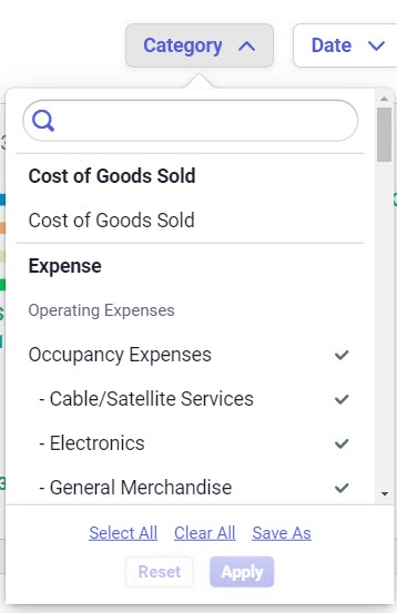
What are Top Expense Categories?
In order to understand where your money goes, this chart shows the top categories where you spend money. When you are looking for opportunities to save money or cut expenses, this chart will help you identify areas where you might be overspending.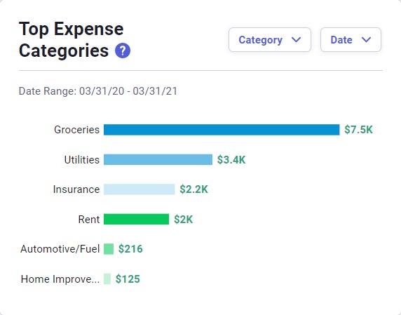
Click on the 'Date' drop-down to change the date range and click on the blue 'Category' drop-down in the upper right corner of the chart to choose which categories are included in the Top Expense Categories chart.
Neat Tip: Use the Save As button to save your category selections as a category filter that you can quickly access over and over again!
What is Cash Balance?
Part of practicing good cash flow discipline is understanding how much cash you have on hand and where it is located. This chart displays your current cash balance and the accounts where you have money available to your business. Use this information to make sure you are putting your money to good use by taking advantage of accounts where you can earn interest for cash that is not immediately needed to run your business.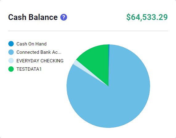
What is Profit & Loss
Profit & Loss Insights help you to keep track of how your business is performing month over month. With P&L Insights, you can quickly compare your Gross Profit and Net Profit totals at a glance.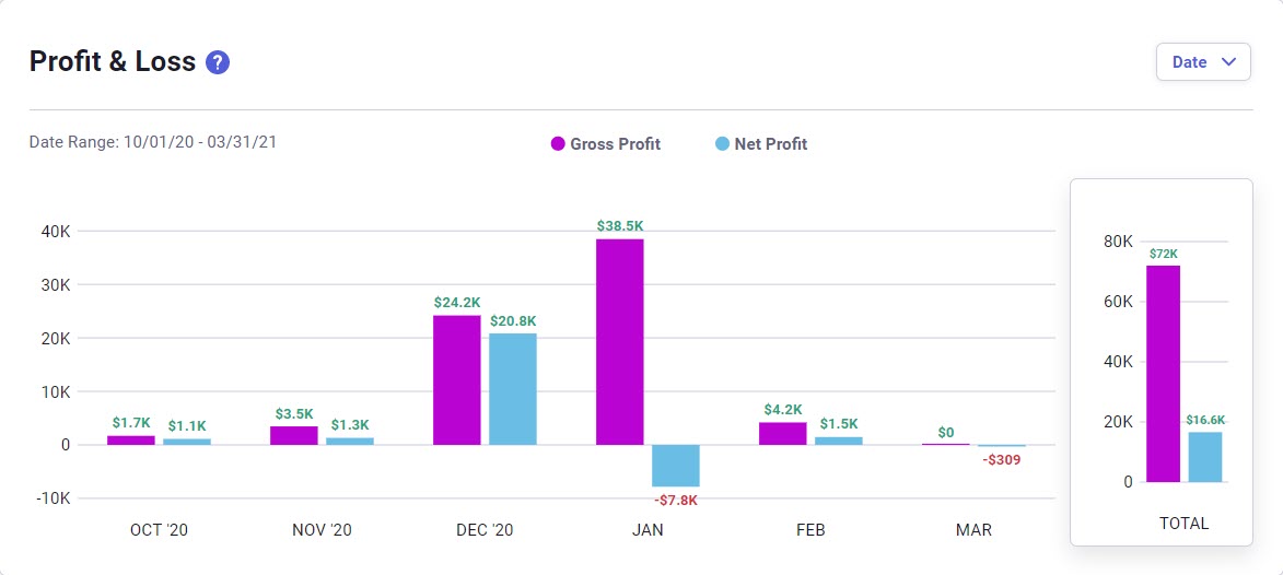
Click on the blue 'Date' drop-down in the upper right of the Profit and Loss chart to adjust the date range. Alternatively, you can type in your date range in the Start and End date fields below the left calendar.
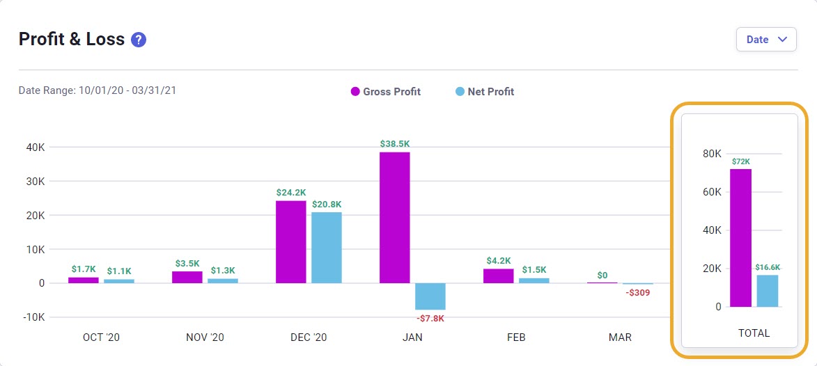
Changing the date range will also automatically update the graph on the right that shows the sum total for the selected date range.
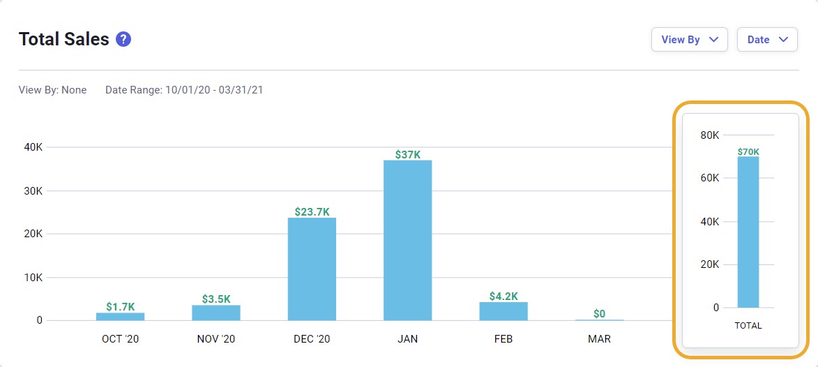
What are Total Sales?
The Total Sales chart can help you determine how the market is responding to your offerings. The Total Sales chart is a great way to understand which goods and services you tend to sell most. You can also see if a product has seasonal fluctuations, so you can better manage your inventory levels. Use this chart to manage your product/service mix. You can take advantage of high performers and look to replace items that tend to move more slowly.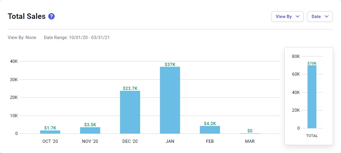
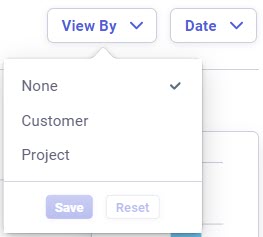
Click the blue 'View By' drop-down to change how you view the chart. Click the blue 'Date' drop-down to select a date range.
Changing the date range will also automatically update the graph on the right that shows the sum total for the selected date range.